 Shareforce vraagt om je toestemming om meldingen te kunnen sturen.
 Principles of a flat design
20 June 2013 - John Kivit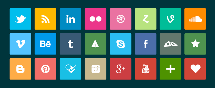
More and more apps and websites are getting a flat design. This new design trend is an answer to the need for more simplicity in a world with an overflow of information. A flat design is, like the name says, flat as a pancake. Everything that is superfluous has been removed from the design. It therefore has a very clean and crisp look.
Lots of big players like Microsoft (Metro), Apple (iOS7) and Google have taken there first steps on the road to simplicity. If you think about it, it’s kind of strange that up until now we have tried to replicate the offline world by adding depth to web and app designs. The user experience has become quite cluttered because of this. Users want simplicity in a world in which we are overloaded with thousands of messages per day.
In this article I will describe the basic details of a flat design:
1. No more depth
A flat design is a 2d experience. In the flat design concept all drop shadows, bevels, embossing, gradients or other stuff that add depth are removed. In contrast to a skeuomorphic design in which all these elements are used to simulate a 3D experience.
2. Simple elements
Elements like buttons and icons are as simple as possible. Often in one or maximum two colors. White, black or grey’s are used to give everything a very simple look. Also the shapes that are used are very simple: rectangles, circles and squares.
3. Beautiful typography
Nice, elegant fonts and the positioning of text are very important in a flat design. It not alone adds style, but also makes sure you will have a USP over the competition. Steve Jobs got famous for the design of his Apple products. His classes in calligraphy learned him how beautiful typography can make a difference. Say goodbye to Arial, Helvetica and Times New Roman. Those days are behind us. Find new, clean and crisp fonts, like in for example the new Apple iOS7 design.
4. Lively colors
Color is more important if you have little to play with in your design. Use lively colors that make an everlasting impression. Say goodbye to boredom. Nature is full of color and can be used for inspiration for this. White, black, grey’s or retro colors can be used to support the simplicity of the design.
5. Minimalist approach
Less is more. A flat design is the art of getting rid of all unnecessary stuff. An art that most current websites and apps have not yet mastered. A good balance between all elements in your design is key. Dare to choose. Choosing is no longer loosing, but winning the hearts of your users.
Do you want to know more about flat design? This excellent article of Design Modo was my inspiration source for this short article. It has all the information you will need. Do you want to see examples of a flat design? Surf to Fltdsgn.com. They have a lot of lovely examples of modern flat designs.
![]()